
the ways publishers could provide extra context
to body text.
So, what makes good link text?
While the current W3C’s Web Content Accessibility Guidelines – WCAG2 – emphasise providing overall context for a link, little emphasis is placed on making the text of a link itself understandable to users with disabilities. I believe this is the wrong approach. Screen reading applications offer only limited ways to interpret a page. One common method is to generate a list of links (without context) to determine the content of the page. Screen reader users also often scan a page by simply tabbing from link to link (without reading the text in-between). When confronted with a bunch of “Click here to download the annual report” and “More on boating”, such techniques are useless. Link text also becomes a serious issue once you start talking about mobile and tablet sites. Two of the most well-known sets of mobile accessibility guidelines — the W3C Mobile Best Practices and the BBC’s Mobile Accessibility Guidelines — suggest clearly identifying and describing the target of the link. In my work auditing web sites, I identify all the “click here” links and flag them as accessibility failures. Sure, “click here” links can be activated by the keyboard, but it implies that you need a mouse to activate the link. And that’s a failing. Sure, it’s a little more difficult to argue that “here” and “more” links are inaccessible strictly under WCAG2. I still flag them as errors, but it’s almost impossible to find a success criterion that they fail. So, here is my 15 point checklist to keep in mind when linking text on the web.Rule 1 : Don’t use the word “link” in your links
This is an easy one. Screen readers tell the user when they encounter a link, so you don’t need to use the words “link” or “links to” or “goes to” in your link text.Rule 2: Don’t capitalize links

CAPITALIZED TEXT IS DIFFICULT TO READ. IT’S ALL ONE BIG RECTANGLE. Capitalized text is difficult to read. It’s all one big rectangle.The general rule when it comes to reading is: if it’s more difficult to the general public then it will be almost impossible for a person with a cognitive disability to read. And who wants to shout at their audience?
Rule 3: Avoid ASCII characters

ABBR or ACRONYM elements.
However if you absolutely must use emoticons, then at least mark them up with some ARIA:
<span class="sr-only">Smiley face</span>
<span aria-hidden="true">:-)</span>16 – 17 years, 17 – 21 yearsSome screen readers will read the above link as “link one six one seven years end link“. It is much clearer to replace the em-dash with the word “to”. In that case, screen readers will read it as “link sixteen to seventeen years end link”. Much clearer, right?
Rule 4: Avoid using URLs as link text
When we see “www.londontoylibrary.co.uk”, we see the words ‘london’, ‘toy’ and ‘library’, but a screen reader is going to read the URL letter-by-letter. “Double-U, Double-U, Double-U, Dot, El-Oh-En-Dee..” As you can imagine, this becomes unintelligible after the first 4-5 letters. So, always use meaningful text as links, such as “London Toy Library”. If you really need to provide the URL in text — for example if you expect people to print out the content — then append the URL to the link text in the print style sheet with something like:
@media print{
   a:after{content:" (" attr(href) ") ";font-size:0.8em;font-weight:normal;}
}
Rule 5: Keep link text concise
It’s a really good idea to restrict the length of your link text to a maximum of 100 characters. Screen readers have a huge array of functions that allow users to skip to the next word, next sentence, next paragraph or next heading, but they have to read the entirety of a link. So, you can imagine that if you have turned an entire paragraph into a single link (which we’re seeing more of with the advent of block-level links in HTML5), the entire link is read out by the screen reader. You can imagine how annoying this could become.Rule 6: Restrict the number of text links on a page
This is important because users see links as a form of navigation: they know they are not on the right page so they are looking for links that will take them to where they want to go. If there are a lot of links on a page, it makes it that much harder to navigate a site. And of course, screen reader users can pull out all the links in a page, so if there are hundreds of links then reading through them all is a nightmare. Ok, so how many links are too many? That’s the ‘How long is a piece of string’ question, and depends on the type of site that you have. Just bear in mind the users that are navigating from link to link when you’re constructing your pages. What about areas where additional link text or contextual information is essential? There are three key areas where additional link text or contextual information is a must:- linking to downloads
- links opening in a new window
- pagination / alphabetized links.
Rule 7: Don’t link directly to downloads
In the usability testing I’ve witnessed, one thing is universal: people hate downloads. It is even more annoying when they open a download without expecting it. But what is a mere annoyance for general users becomes a very serious problem for people with disabilities. It is essential you properly indicate when a link activates a download – and make sure this information is in the link text. If you use a ‘PDF’ or ‘Word’ icon instead of the text, always make sure they have useful ALT attributes! One thing I have seen recently, is the automatic addition of a download icon via CSS. Remember that this is essentially invisible to screen readers — they don’t read CSS images — so never embed critical information in CSS. I’ve always recommended that you add some more detail than just the type of download, for example the size of the download too. So, that’s all fine if you have one document. But what if you have a whole bunch? WCAG2 now allows something like the following (with “Disability Services Annual Report” coded as a heading):Disability Services Annual Report 2013 PDF, 2013 Word 2012 PDF, 2012 Word 2011 PDF, 2011 WordOr even something like this (where the first column and first row are coded table headers using <th>):
| Title | Word | |
|---|---|---|
| 2013 Disability Services Annual Report |  |
 |
| 2012 Disability Services Annual Report | |
|
| 2011 Disability Services Annual Report | |
|
| Title | Word | |
|---|---|---|
| 2013 | |
|
| 2012 | |
|
| 2011 | |
|
Rule 8: Always alert the user when opening new windows
It is important to warn people with disabilities that a new window has been opened — especially people with cognitive disabilities who may not notice. The best way to indicate that a link opens in a new window is to add text to the link, such as “(opens in new window)”. However, you can also add an icon with an appropriate ALT attribute, but you must explain what the icon means somewhere on the page, like FRIENDS Life does (although note their accessibility information is woefully out-of-date):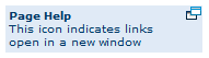 If you absolutely must use a character to indicate a link, I’ve started using Font Awesome’s “External link” icon for opening in new windows.
The HTML is:
If you absolutely must use a character to indicate a link, I’ve started using Font Awesome’s “External link” icon for opening in new windows.
The HTML is:
<a href="http://www.google.com/" target="_blank">Google
 <span class="sr-only">Opens in new window</span>
 <i aria-hidden="true" class="fa fa-edit fa-external-link"></i>
</a>
.sr-only {
  position: absolute;
  width: 1px;
  height: 1px;
  padding: 0;
  margin: -1px;
  overflow: hidden;
  clip: rect(0, 0, 0, 0);
  border: 0;
}
 Always include the icon after the link text. Otherwise screen reader users who pull out the links of each page, will get a whole list starting with “opens in new window” instead of meaningful link text.
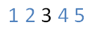
Rule 9: Be aware of pagination and alphabetized links
For a visual user, a list of numbered links at the bottom of the search results means “move to the next page”, but in my user testing, I find over and over again that people with disabilities do not know what these links mean. To make these links accessible, just add some contextual information before the list of links, such as “Go to search page: 1 2 .. etc”. If it’s an alphabetized list of links, then a heading explaining the links is best, such as: Author’s surnames starting with: A | B | C | D | E | F | G | H | I | J | K | L | M | N | O | P | Q | R | S | T | U | V | W | X | Y | Z User agents and assistive technologies now are adept at rendering adjacent links, so there’s no need to put vertical bars, like in the example above, between links any more. It is still important that there is space between adjacent links. Android devices zoom in on an area when the user touch encompasses more than one link, but Apple and Windows devices do not. I recommend using the CSS border property around links to make them look more like buttons. This makes the entire space within the border clickable, and can be achieved by simply adding:
border: 1px solid black;
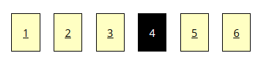
 This violates Success Criterion 1.4.1 Use of Color: “Color is not used as the only visual means of conveying information, indicating an action, prompting a response, or distinguishing a visual element“.
The best thing to do is make the current page number plain text and the other numbers links.
And make sure those links are underlined! This way the links are visually distinct (without relying solely on color) and programmatically distinct as well.
The other problem with pagination and alphabetized links is that they generally present a very small target area for the user to select.
This is no problem for keyboard users, however people using other input devices, such as a mouse, joystick or touch screen can find one letter links very difficult to properly select.
It’s a good idea to make single character links a larger text size than the surrounding content.
It’s also wise to use plenty of CSS padding around the link to increase the clickable area, such as:
This violates Success Criterion 1.4.1 Use of Color: “Color is not used as the only visual means of conveying information, indicating an action, prompting a response, or distinguishing a visual element“.
The best thing to do is make the current page number plain text and the other numbers links.
And make sure those links are underlined! This way the links are visually distinct (without relying solely on color) and programmatically distinct as well.
The other problem with pagination and alphabetized links is that they generally present a very small target area for the user to select.
This is no problem for keyboard users, however people using other input devices, such as a mouse, joystick or touch screen can find one letter links very difficult to properly select.
It’s a good idea to make single character links a larger text size than the surrounding content.
It’s also wise to use plenty of CSS padding around the link to increase the clickable area, such as:
padding-left: 1em;
padding-right: 1em;
span.pag a {
  padding: 1em;
  border: 1px solid black;
  margin: 0.5em;
  background: #ffffc3;
  color: black;
}
span.current-page {
  padding: 1em;
  border: 1px solid black;
  margin: 0.5em;
  background: black;
  color: white;
}
<span class="pag">
 <a href="http://www.one.com">1</a>
 <a href="http://www.two.com">2</a>
 <a href="http://www.three.com">3</a>
 <span class="current-page">4</span>
 <a href="http://www.five.com">5</a>
 <a href="http://www.six.com">6</a>
</span>
 Of course, feel free to fancy it up a bit with rounded corners and some color!
Rule 10: Be mindful when using anchor links
Rule 11: The case for underlining links
People expect links to be underlined. When they see underlined text they expect it to be a link (which is why you should never underline text in the online world unless you are representing a link). WCAG2 does recommend that you underline your inline text links, but also allows developers to meet the accessibility criterion if they use a contrast ratio of 3:1 with surrounding text and providing additional visual cues on focus for links or controls where color alone is used to identify them. This requires that your text links contrast sufficiently with surrounding text (the W3C has a list of link colors that contrast appropriately with black text and a white background) and there is an additional visual cue when the link receives mouse or keyboard focus. This visual cue can be an underline (go on, make those links underlined!), bold, italic or increase in font size or it can be the addition of a glyph or image. It can be implemented through CSS as this only needs to be a visual indicator. But remember to add a:focus to a:hover!Rule 12: Design with keyboard-only users in mind
The extra information conveyed in the TITLE attribute of a link HREF, (see H33: Supplementing link text with the title attribute, is not available to keyboard users. In addition, this tooltip cannot be resized to suit the user, failing Level AA Success Criterion 1.4.4: Resize text. Neither can the colors of the text or background color be changed. Another serious keyboard issue can be a lack of a keyboard focus indicator, which can often make a site almost impossible to use by keyboard users. The only way for a keyboard user to know which link, navigation item or field has focus is if that item has a keyboard focus indicator. As you can see from the next screenshot, the item with the keyboard focus is a different color to the surrounding content and outlined with a dotted border.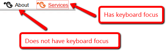
Rule 12: Be mindful when using images as links
There are special requirements for images that are links. The ALT attribute acts as the link text. As mentioned earlier, you don’t need to add the word “link”, and you also don’t need to add the word “graphic” or “image”, as screen readers identify images to their users as well. You do need to be careful when creating ALT attributes for image links, because the ALT attribute has two requirements: it must describe the image and it must tell the user what activating the link will do. For an image button then an ALT attribute like “Search”, “Find” or “Submit” is great, but avoid using the word “Go” as I’ve found users don’t understand that terminology (“Go where?” they ask). If you do have a linked image next to a text link that goes to the same page, then in most cases that image needs an empty ALT attribute. This is a requirement under Technique H2: Combining adjacent image and text links for the same resource. It is also a requirement that one link should encompass the link text and the image. Happily, this can be done now as HTML5 allows A as a block-level element. There is one exception to this rule, and that is when the image conveys additional important information not provided in the text link.Here’s what NOT to do with linked images
 The code for this image/link combination is so woeful, I just had to include it here:
<div class="list-preview-item-wide">
<a onclick="(new Image()).src='/rg/list-user-wide/list-image/images/b.gif?link=%2Flist%2Fgm7xsjP4vD8%2F';" href="/list/gm7xsjP4vD8/"><img alt="image of title" title="image of title" src="http://ia.media-imdb.com/images/M/MV5BMTIxMjc4NTA2Nl5BMl5BanBnXkFtZTYwNTU2MzU5._V1._SX86_CR0,0,86,86_.jpg" class="loadlate" width="86" height="86"/>
<noscript><img height="86"
 width="86"
 alt="image of title" title="image of title"
 src="http://ia.media-imdb.com/images/M/MV5BMTIxMjc4NTA2Nl5BMl5BanBnXkFtZTYwNTU2MzU5._V1._SX86_CR0,0,86,86_.jpg" class="" /></noscript>
</a></div>
 <div class="list_name"><b><a onclick="(new Image()).src='/rg/list-user-wide/list-title/images/b.gif?link=%2Flist%2Fgm7xsjP4vD8%2F';" href="/list/gm7xsjP4vD8/">Top TV Series of the Past 20 Years</a></b></div>
<a href="/list/gm7xsjP4vD8/">
<span class="list-preview-item-wide">
<img alt="The Sopranos" src="http://ia.media-imdb.com/images/M/MV5BMTIxMjc4NTA2Nl5BMl5BanBnXkFtZTYwNTU2MzU5._V1._SX86_CR0,0,86,86_.jpg" class="loadlate" width="86" height="86"/>
</span>
<span class="list_name"><b>Top TV Series of the Past 20 Years</b></span></a>
Rule 13: Eliminate broken or empty links
Most people use a tool to find the broken links on their site, so I don’t often come across those. But in almost every site that I test, I find empty links like this:
<a href='someplace.html'></a>

Rule 14: Make your links consistent
Consistency is your friend. It lets your users orient themselves quickly. Everything on your site should be consistent: your headings, field labels, buttons etc. You links are no exception to this rule. This is especially important if you have decided, despite my urging, not to underline your links. Your users will browse your site and determine how you display your inline link text – so make sure it is consistent! You must never use one color to indicate links on one page and then another color on another page.Rule 15: Test your color contrast
You need to ensure that the color of your link text contrasts sufficiently with the background color. This is required whether your links are underlined or not. If you change the color of the link on mouse and keyboard focus, you need to make sure that new color also meets color contrast requirements. There are a number of online tools that make testing contrast both painless and scientific. These include:- Check My Colors (checkmycolours.com)
- Luminosity Colour Contrast Ratio Analyser (juicystudio.com)
You made it!
As you now know if you got this far, there are a range of (usually) simple ways you can make your site easier to access for people with disabilities. There are also even more ways to make the experience a nightmare. Choose wisely. I think that should cover things off — but if you’re looking for even more detail: 1) I have an even more detailed discussion on accessible links on my own blog. 2) Also try these Accessibility fact sheets:- Manager Factsheet on links
- Developer Factsheet on links
- And for a handy HTML5 tag reference, check out Digital’s HTML5 cheat sheet
Frequently Asked Questions (FAQs) on Making Accessible Links
What are the key elements to consider when creating accessible links?
When creating accessible links, it’s crucial to consider several elements. Firstly, the link text should be descriptive and provide context about the destination. Avoid using generic phrases like “click here” or “read more”. Instead, use meaningful text that gives users an idea of what to expect when they click the link. Secondly, ensure that the link is easily identifiable. This can be achieved by using a different color for the link text and underlining it. Lastly, make sure the link can be accessed using keyboard navigation. This is particularly important for users who cannot use a mouse.
How can I make my links accessible for screen reader users?
Screen reader users rely on the link text to understand the purpose of the link. Therefore, it’s important to use descriptive link text that provides context. Avoid using URLs as link text, as they can be confusing and difficult to understand for screen reader users. Additionally, if you’re using an image as a link, make sure to provide alternative text that describes the link destination.
What is the importance of keyboard navigation in link accessibility?
Keyboard navigation is crucial for link accessibility as it allows users who cannot use a mouse, such as those with motor disabilities, to navigate through the webpage. To ensure your links are keyboard accessible, they should be able to receive focus and be activated using the keyboard. This is typically achieved by using the “tab” key to navigate and the “enter” key to activate the link.
How can I make my links visually distinguishable?
Making your links visually distinguishable is important for users with visual impairments. This can be achieved by using a different color for the link text and underlining it. However, color alone should not be used to distinguish links, as color-blind users may not be able to perceive the difference. Therefore, it’s recommended to also use other visual cues, such as underlining or bolding the link text.
What is the role of alternative text in link accessibility?
Alternative text plays a crucial role in link accessibility, particularly for users who use screen readers. If an image is used as a link, the alternative text should describe the link destination. This allows screen reader users to understand the purpose of the link, even if they cannot see the image.
How can I ensure my links are accessible on mobile devices?
To ensure your links are accessible on mobile devices, they should be large enough to be easily tapped with a finger. Additionally, there should be sufficient space around the link to prevent accidental activation of adjacent links. It’s also important to ensure that your links are easily distinguishable and can be activated using assistive technologies.
What is the importance of link order in accessibility?
The order of links is important for users who navigate using a keyboard or screen reader. Links should be ordered logically and consistently throughout the webpage. This helps users predict where the next link will take them and makes navigation easier.
How can I make my links accessible for users with cognitive disabilities?
To make your links accessible for users with cognitive disabilities, use clear and simple language for the link text. Avoid using jargon or complex phrases. Additionally, provide context for the link so users can understand its purpose without having to read the surrounding text.
What is the role of ARIA in link accessibility?
ARIA (Accessible Rich Internet Applications) can be used to enhance link accessibility. For example, the ‘aria-label’ attribute can be used to provide a descriptive label for links that do not have meaningful text. This can be particularly useful for links that are represented by icons.
How can I test the accessibility of my links?
There are several tools available to test the accessibility of your links. These include automated testing tools, manual testing, and user testing. Automated testing tools can identify technical issues, while manual testing and user testing can provide insights into the user experience. It’s recommended to use a combination of these methods to ensure your links are fully accessible.
 Gian Wild
Gian Wild has been working in accessibility since 1998. She worked on the very first Australian accessible web site and was the accessibility consultant for the Melbourne 2006 Commonwealth Games. For six years she was actively involved in the W3C Web Content Accessibility Guidelines Working Group. Gian Wild is the Director of AccessibilityOz.